Most franchise marketing dashboards fail. Not because the data is wrong, but because the design does not serve the user. Franchisees are busy operators running day-to-day businesses. They need dashboards that answer their key questions in under 30 seconds, not data warehouses that require an analytics degree to navigate. This guide covers the UX principles that make franchise marketing dashboards effective.
The 3-Second Rule
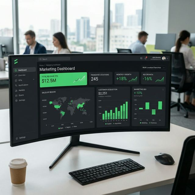
A franchisee should understand their marketing performance within 3 seconds of opening the dashboard. Lead with a single headline metric (typically marketing ROI or revenue generated) displayed prominently at the top with a clear trend indicator (up/down arrow with percentage change). Use traffic light colors (green/yellow/red) to immediately communicate whether performance is good, needs attention, or is underperforming. Every additional second of cognitive load reduces the likelihood of ongoing dashboard engagement.
Progressive Disclosure Architecture
Layer information in three levels: Level 1 (overview): 4 to 6 key metrics with trend lines visible on the landing screen. Level 2 (channel detail): click any metric to see channel-level breakdown (Google Ads, Facebook, SEO, Email). Level 3 (campaign detail): click any channel to see individual campaign performance. This progressive disclosure approach prevents information overload while allowing franchisees who want deeper insight to drill down without leaving the dashboard.
Benchmarking and Comparison
Franchisees are motivated by comparison. Include anonymized benchmark data on every dashboard: how does this location's performance compare to the system average? To the top quartile? To similar-sized locations in similar markets? These comparisons transform raw metrics into actionable context. A cost-per-lead of $25 means nothing in isolation, but 'your CPL is 15% below the system average' tells a compelling story.
Key Takeaways
- Apply the 3-second rule: key insight visible immediately on dashboard load
- Use progressive disclosure: overview, channel detail, campaign detail
- Traffic light color coding communicates performance status instantly
- Anonymized benchmarks provide context that raw metrics lack
- Monthly NPS surveys on dashboard experience drive continuous UX improvement
Want to implement these strategies?
Get a free franchise marketing audit from our team.